In an era where data drives decision-making across industries, the ability to visualize data in real time is a game-changer. Real-time data visualization turns raw, complex datasets into comprehensible visual formats, enabling swift and informed decisions. Whether you are tracking sales performance, monitoring operational efficiency, or analyzing customer behavior, the right visualization techniques and tools can transform your data into actionable insights.
Table of Contents
Types of Data Visualization Techniques
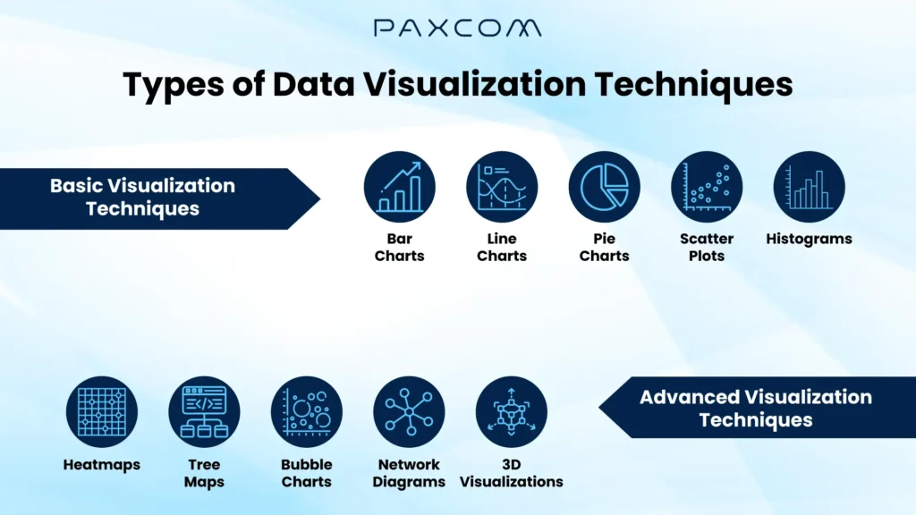
Basic Visualization Techniques
- Bar Charts: Ideal for comparing quantities across categories, bar charts are straightforward to interpret.
- Line Charts: Perfect for showing trends over time, line charts are commonly used in financial data analysis.
- Pie Charts: Pie charts are useful for displaying proportions; pie charts help visualize parts of a whole.
- Scatter Plots: Effective for identifying relationships between variables, scatter plots can reveal correlations and outliers.
- Histograms: These are used to represent the distribution of numerical data, and they are great for understanding the underlying frequency distribution.
Advanced Visualization Techniques
- Heatmaps: These provide a visual representation of data where values are depicted by color. Heatmaps are particularly useful for identifying patterns, correlations, and outliers.
- Tree Maps: Ideal for displaying hierarchical data, tree maps use nested rectangles to show proportions among categories.
- Bubble Charts: These are similar to scatter plots but add a third dimension of data through the size of the bubbles, making them useful for multi-variable analysis.
- Network Diagrams: Used to visualize relationships and flows between entities, network diagrams are essential in fields like social network analysis.
- 3D Visualizations: While more complex, 3D visualizations can provide depth and additional insight into data sets, useful in scientific and engineering applications.
Practical Application of Visualization Techniques
Business Intelligence
Data visualization tools are pivotal in business intelligence for creating real-time dashboards that monitor key performance indicators (KPIs). For instance, a retail company like Amazon might use dashboards to track sales performance across different regions and product categories. These dashboards provide immediate insights into sales trends, revenue fluctuations, customer engagement, and operational efficiency. By visualizing this data, companies can quickly identify trends, spot anomalies, and make informed decisions to improve performance and drive growth.
Healthcare
In healthcare, data visualization is essential for tracking patient health records and identifying trends in disease outbreaks. For example, during the COVID-19 pandemic, health organizations used visual dashboards to monitor the spread of the virus, track vaccination rates, and allocate medical resources efficiently. By visualizing patient data, clinicians can gain insights into treatment efficacy, patient outcomes, and potential health risks. This enables more accurate diagnoses, personalized treatment plans, and improved overall care quality. Real-time visualization of health metrics also aids in managing public health emergencies by providing actionable insights for rapid response.
Finance
Financial analysts rely on data visualization to monitor stock prices, analyze market trends, and forecast economic scenarios. For instance, investment firms use visualization tools to track real-time stock market data, analyze historical performance, and predict future market movements. Visualization tools simplify complex financial models and data sets, making it easier to understand and communicate financial information. By visualizing data, analysts can quickly identify investment opportunities, assess risk, and develop strategies to optimize portfolio performance. Real-time visualizations are crucial for making timely decisions in fast-paced financial markets.
Marketing
Marketers use data visualization to track campaign performance, understand customer behavior, and optimize marketing strategies. For example, a company like Nike might use visualization tools to analyze data from various marketing campaigns, segment audiences based on demographics and purchase history, and measure the effectiveness of different marketing channels. Visual analytics help segment audiences, tailor marketing efforts, and measure marketing campaigns’ effectiveness. By visualizing data from various channels, marketers can gain a comprehensive view of customer interactions and preferences, enabling more targeted and impactful marketing initiatives. Real-time visualization ensures that marketing strategies can be adjusted promptly to maximize engagement and ROI.
Techniques and Tools for Real-Time Data Visualization
Techniques
- Dashboards: Interactive dashboards provide a consolidated view of critical metrics, allowing users to drill down into specific data points for detailed analysis. For example, a sales dashboard might display real-time sales data, revenue by region, and top-performing products.
- Heat Maps: These highlight data density and distribution, making it easy to spot patterns and outliers. For instance, an e-commerce company might use heat maps to visualize customer clicks on their website to identify popular areas and improve user experience.
- Time Series Analysis: Visualizing data over time helps identify trends, seasonal variations, and long-term patterns. An airline might use time series analysis to monitor flight booking trends and adjust pricing strategies accordingly.
- Geospatial Visualization: Mapping data geographically can reveal location-based trends and insights. For example, a logistics company might use geospatial visualization to track delivery routes and optimize their supply chain.
Visualization Techniques and Data Interpretation
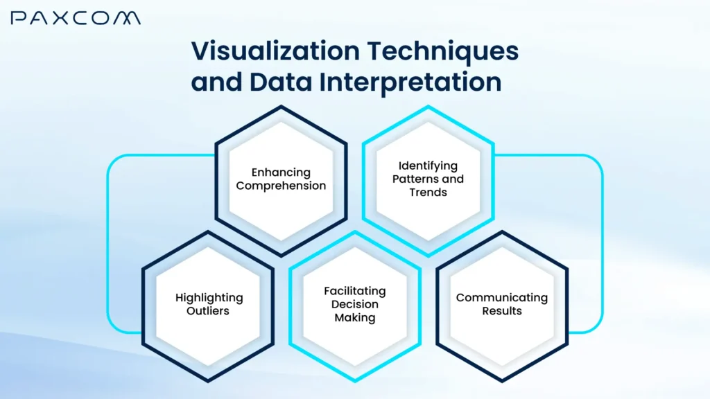
Enhancing Comprehension
- Simplified Data Presentation: Visualization techniques convert raw data into graphical formats such as charts, graphs, and maps, making complex information more accessible. These visual formats help stakeholders understand intricate data sets quickly, eliminating the need for extensive data analysis.
- Immediate Insights: By presenting data visually, patterns and relationships that are not easily noticeable in spreadsheets become evident. This immediate clarity helps in communicating findings effectively across different levels of an organization.
Identifying Patterns and Trends
- Trend Analysis: Visualizations like line charts and area graphs are particularly useful for tracking changes over time. They enable users to identify trends, whether increasing, decreasing, or stable, which is essential for predictive analytics and strategic planning.
- Pattern Recognition: Tools such as scatter plots and heat maps help in spotting correlations and patterns within the data. Recognizing these patterns is vital for understanding underlying behaviors and making informed predictions about future outcomes.
Highlighting Outliers
- Anomaly Detection: Outliers are data points that differ significantly from other observations. Visualization techniques, such as box plots and scatter plots, make it easier to detect these anomalies. Identifying outliers is crucial for maintaining data quality and ensuring accurate analysis.
- Impact Assessment: By highlighting outliers, visualizations allow analysts to assess their impact on overall data trends. This can lead to deeper insights and more robust conclusions by addressing potential anomalies directly.
Facilitating Decision-Making
- Clear Insights for Action: Effective data visualizations provide clear and actionable insights that facilitate better decision-making. Dashboards and summary charts allow decision-makers to quickly evaluate the current situation and understand key metrics at a glance.
- Forecasting and Planning: Visual tools such as time series charts and predictive models help forecast future outcomes based on historical data. These forecasts support strategic planning and resource allocation by providing a visual representation of potential future scenarios.
Communicating Results
- Effective Storytelling: Visualizations enable the telling of a data-driven story. They help in illustrating the narrative behind the numbers, making it easier to convey findings and recommendations to a broader audience.
- Stakeholder Engagement: Engaging visualizations can capture the attention of stakeholders, fostering a deeper understanding and engagement with the data. Interactive visualizations, in particular, allow users to explore data dynamically, leading to more meaningful discussions and decisions.
Best Practices for Creating Effective Visualizations
Creating effective visualizations involves more than just selecting the right type of chart or graph. It requires thoughtful consideration of how to present data in a clear, accurate, and engaging way. Here are five detailed best practices for creating effective visualizations:
- Understand Your Audience and Purpose
- Tailored Content: Know who will be viewing your visualizations and what they need from the data. Customize the complexity and detail level according to your audience’s familiarity with the subject.
- Clear Objectives: Define the primary goal of your visualization. Whether it’s to inform, persuade, or explore, having a clear objective will guide your design choices and ensure the visualization serves its intended purpose.
- Choose the Right Type of Visualization
- Match Data to Visualization: Different data types and relationships require different visualization techniques. Use bar charts for comparing categories, line charts for trends over time, scatter plots for relationships between variables, and pie charts for parts of a whole.
- Avoid Misleading Graphs: Ensure that the chosen visualization accurately represents the data without distortion. Avoid 3D effects or disproportionate scaling that can mislead the viewer’s perception of the data.
- Focus on Clarity and Simplicity
- Eliminate Clutter: Remove unnecessary elements such as excessive gridlines, background colors, and decorative graphics that do not add value. Keep the design clean and focused on the data.
- Use White Space: Utilize white space effectively to separate different parts of the visualization and prevent it from looking crowded. This makes it easier for viewers to focus on the important information.
- Use Color and Design Wisely
- Consistent Color Schemes: Use a consistent and meaningful color scheme. Differentiate data series with distinct colors, but avoid using too many colors that can overwhelm the viewer.
- Accessibility: Ensure that your color choices are accessible to colorblind viewers. Use textures, patterns, or labels in addition to color to convey information.
- Emphasis and Hierarchy: Highlight key data points or trends using bold colors or larger markers to draw attention. Establish a visual hierarchy to guide the viewer through the data logically.
- Provide Context and Annotations
- Contextual Information: Include titles, labels, and legends that provide necessary context for interpreting the visualization. Clearly label axes, data points, and units of measurement.
- Annotations: Use annotations to highlight important data points, trends, or anomalies. Adding brief explanatory notes can help viewers understand the significance of the data and make the visualization more informative.
Conclusion
Mastering real-time data visualization is essential in today’s data-driven world. By transforming raw data into understandable visual formats, real-time data visualization enables swift and informed decision-making. Whether it’s tracking sales, monitoring operations, or analyzing customer behavior, employing the right visualization techniques and tools can unlock actionable insights that drive growth and efficiency. By leveraging Paxcom’s expertise , brands can transform their data into actionable insights, drive strategic decisions, and achieve better outcomes in the competitive market landscape.